Amazon Brand Store Image Sizes and Tile Specs
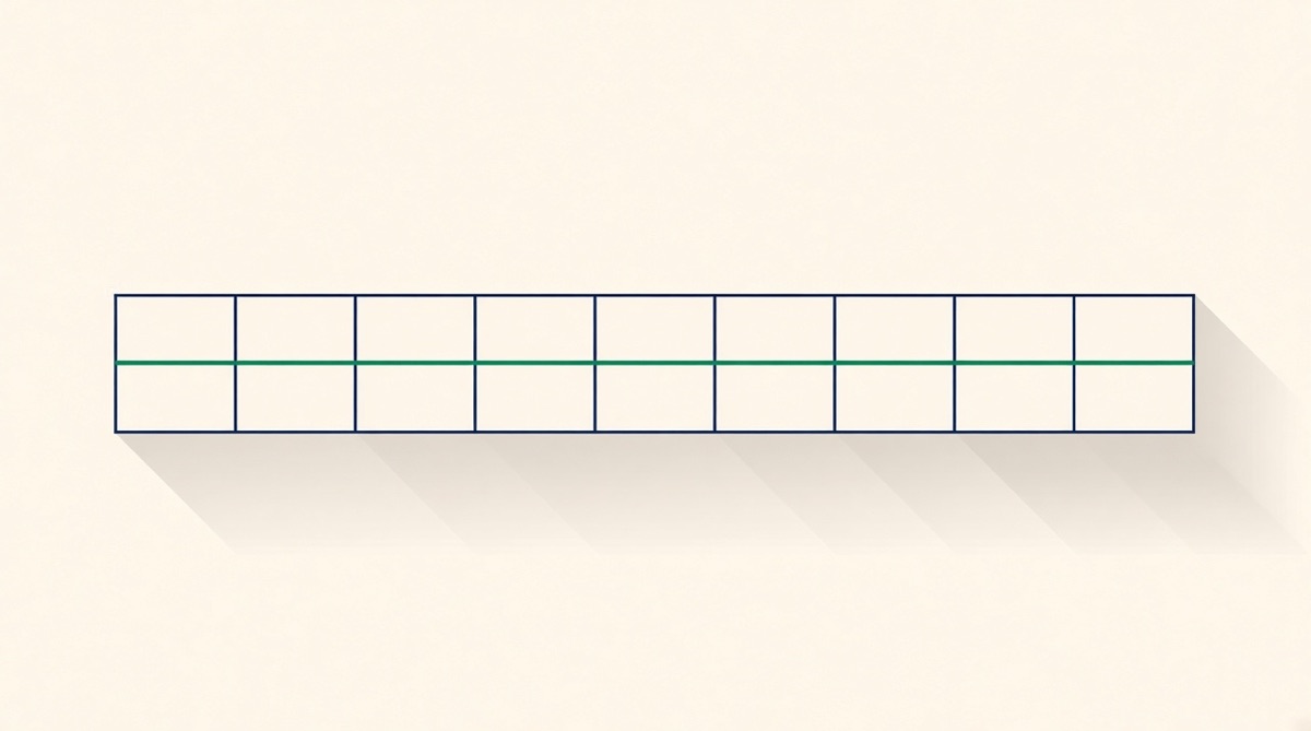
The Brand Store hero needs 3000 × 600 px minimum and loses up to 30% of its width to cropping, 15% per side, with the logo covering roughly another 18% of the left on small screens. Tiles come in 750 × 750, 1500 × 750, 1500 × 1500 and full-width at 1500–3000 px. Every asset caps at 5 MB, and a page holds up to 20 sections.
An Amazon Brand Store is built from tiles on a widescreen grid, and it is the only Amazon surface where your assets get cropped aggressively by the device rather than displayed as drawn. The hero needs 3000 × 600 px minimum and can lose up to 30% of its width, 15% from each side. Everything else is a 750, 1500 or 3000 px tile. The design problem is not the sizes: it is that the store sits on top of listings whose gallery images were made separately, and shoppers move between the two in one session.
The asset list, with the numbers
These are Amazon Ads' published Stores specs as of August 2026. Every asset caps at 5 MB.
| Asset | Minimum | Notes |
|---|---|---|
| Hero / header image | 3000 × 600 px | Up to 30% cropped, 15% per side |
| Brand logo | 400 × 400 px | Covers ~18% of the hero's left side on small screens |
| Image tile, full width | 1500 px wide | 3000 px wide recommended |
| Image tile, large | 1500 × 1500 px | Square |
| Image tile, medium | 1500 × 750 px | 2:1 |
| Image tile, small | 750 × 750 px | Square |
| Image with text overlay, full width | 3000 × 1500 px | Bottom ~19% darkened |
| Shoppable image, full width | 1500 × 750 px | 3000 × 1500 px recommended |
| Gallery | 1500 × 750 px | Up to 8 images |
| Video, full width | 1280 × 640 px | MP4/H.264, aspect 6:4 to 8:3 |
| Background video | 1280 × 640 px | 2–20 seconds, MP4/H.264 |
Page structure is capped too: up to 20 sections per page, a maximum of four background video boxes, and one each of product grid, gallery, featured deals and recommended products.
The hero is a cropping problem, not a design problem
The single most expensive mistake in Brand Store work is a hero built as a poster. Amazon crops it: up to 15% off each side on wide screens, and on screens narrower than about 1500 px the documentation describes up to 16% coming off each side while the brand logo covers roughly another 18% of the left. Add those together and the left third of your hero is not reliably visible on a phone.
Practical rule: put the logo, the headline and any legally required text inside the centre 70% of the frame, and treat the outer 15% on each side as bleed that carries texture and colour only. If your hero has a product on the left and copy on the right, mirror it — the right side survives better because the logo overlay lives on the left.
Text overlay tiles have their own trap. On rectangular tiles Amazon darkens roughly the bottom 19% of the image to make the caption legible; on square tiles roughly 12%. Anything you place low in the frame gets a gradient dropped over it.
Where stores and listings visibly disagree
A product grid tile pulls the ASIN's main image, and the main image is legally a product on pure white, RGB 255,255,255, filling roughly 85% of the frame with no text or props. So the moment you add a product grid, part of your store is a row of white boxes whether you like it or not. That is fine. What is not fine is a store whose custom tiles use a completely different palette, type and photographic treatment from the gallery images a shopper sees two clicks later.
Shoppers arriving from Sponsored Brands land on the store, browse, click into a listing and see the gallery. If the two look like different companies, the store has spent your ad click on a credibility problem. This is the argument for building both from one brand kit rather than two briefs six months apart.
What Graflio does here and what it does not
Graflio's research pass reads a live listing, its reviews and the category best sellers, and produces a brand kit: palette, type, logo placement and a composited cut-out of the real product photo. That kit drives the gallery set, the A+ modules and the store tiles alike, and the same cut-out is reused, so the product looks identical across all three surfaces.
Tiles export at the exact Stores dimensions, RGB, under 5 MB, and every tile opens as layers, which matters because store copy changes on a seasonal cycle: a new claim, a price, a "new for autumn" banner. Those are text-layer edits.
What Graflio does not do: it has no Stores API and does not publish for you. You build the page in the Store Builder, upload the tiles, and submit for moderation like everyone else. It also does not author video, which is a real gap given that background video boxes are among the most effective store sections. And it will not make strategic decisions about page structure — how many pages, what the navigation says, which categories deserve their own page — which is genuine agency work.
Where Graflio helps
- Tiles exported at 750, 1500 and 3000 px, RGB, under 5 MB
- Safe-zone-aware hero composition for the 15%-per-side crop
- One brand kit shared with the gallery and A+ set
- Editable layers for seasonal copy and multilingual EU stores
Where it does not
- No video: background video boxes are outside what we produce
- No Stores API — building and submitting the page is manual
- Page architecture and navigation strategy are not automated
- A real photo or film shoot beats any composited tile for a brand-defining hero
A store build order that works
Build the listings first. The store is a shop window for pages that already convert; a beautiful store pointing at weak listings moves the problem rather than solving it. Then build the hero to the safe zone, then two or three image tiles that each answer a question the gallery raises, then a product grid, and stop. Twenty sections is a ceiling, not a target — most stores that perform are three or four pages deep with fewer sections than the limit allows.
How to decide
If you are Brand Registered and sell more than one product, build a store: it is free, it gives Sponsored Brands somewhere better than a search results page to land, and it is the only Amazon surface where you fully control the layout. If you sell a single SKU, a store is mostly a landing page for ads and a one-page build is enough. If your brand is at the stage where the store is the launch, hire a designer or a studio for the hero and film the background video; nothing generated matches a real shoot for that one asset. And if your store already exists but your gallery images were made by someone else, fix the gallery first — it is what shoppers actually see when they are deciding.
Common questions
What size should an Amazon Brand Store hero image be?
Minimum 3000 × 600 px, maximum 5 MB. Up to 30% of the width can be cropped, 15% from each side, and on small screens the brand logo covers roughly another 18% of the left. Keep logos, headlines and any required text inside the centre 70% of the frame.
What are the Brand Store image tile sizes?
Small tiles are 750 × 750 px, medium 1500 × 750 px, large 1500 × 1500 px, and full-width tiles start at 1500 px wide with 3000 px recommended. Images with text overlay at full width want 3000 × 1500 px. Every asset caps at 5 MB.
How many sections can a Brand Store page have?
Up to 20 sections per page, with a maximum of four background video boxes and one each of product grid, gallery, featured deals and recommended products. Most effective stores use far fewer sections than the limit allows.
Can I use my listing images in the Brand Store?
Product grid tiles automatically pull the ASIN's main image, which is a product on pure white with no text. Your gallery infographics are square and the store grid is mostly widescreen, so they need rebuilding rather than resizing. Reuse the palette, type and product cut-out so the store and the listings read as one brand.
Does a Brand Store cost anything?
The store itself is free for sellers and vendors enrolled in Amazon Brand Registry. The cost is the creative and the traffic: a store with no Sponsored Brands campaigns or external traffic pointed at it gets very little organic visitation.
This page is written by Graflio, so read our own column with appropriate suspicion. Competitor facts are the vendors’ published information as of August 2026 and change often — check before you buy.
Paste one ASIN. Get the whole set.
Graflio reads the live listing and its reviews, studies the best sellers around it, then renders a full set of on-brand infographics — every image still editable in a layer studio. €10 of credits free, no card.
Try Graflio free →