How-to-Use Step Images for Amazon: Sequencing and Step Count
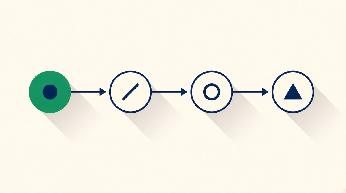
Three or four steps, six at the absolute maximum. Amazon publishes nothing about step counts, so the limit is display size: a 2,000 px canvas renders near 370 px in a phone carousel, leaving roughly 185 px per tile at four steps and 122 px at six. Start step one where the shopper is now — the box arriving — not where a manual starts. One physical action per tile, Arabic numerals plus a connector arrow, and warnings in a footer strip rather than as a numbered step.
A how-to-use image has one job: convince a shopper who has not bought yet that using this thing will be easy. It is not a manual, and treating it as one is why most of them fail. Amazon publishes nothing about how many steps a listing image may contain, so the honest ceiling comes from arithmetic and from what a person can hold in mind at a glance. Both point to four steps, six at the outside. Here is how to sequence, number and lay them out so the sequence survives a phone carousel.
The constraint Amazon does publish, and the one it does not
Amazon's image standards allow text and graphics on secondary images, require them to be accurate and not misleading, and set a floor of 1,000 px on the longest side for zoom with 1,600 px or more recommended. That is the whole of the published guidance that touches a step diagram. There is no rule about step counts, numbering style or icon use, and anyone quoting one is inventing it.
What does constrain you is display size. You can upload up to nine images; the detail page typically shows around six or seven before a shopper has to expand, and the exact count varies by category, device and whether a video occupies a slot. Design at 2,000 × 2,000 px and that image renders near 350–400 px wide in a phone carousel, a downscale of roughly five to six times. Every step tile you draw shrinks by that factor.
The step-count arithmetic
Take a 2,000 px square, reserve about 300 px for a headline, and divide what is left. This is the whole argument about "how many steps", made concrete.
| Steps | Grid | Tile on a 2,000 px canvas | Rendered at ~370 px | What fits in the tile |
|---|---|---|---|---|
| 3 | 1 × 3 row | ~660 × 1,700 px | ~122 px wide | Illustration plus a short line |
| 4 | 2 × 2 | ~1,000 × 850 px | ~185 px wide | Illustration, number, five to seven words |
| 5 | Mixed 3 + 2 | ~660 × 850 px | ~122 px wide | Illustration, number, three words |
| 6 | 3 × 2 | ~660 × 850 px | ~122 px wide | Illustration and a number only |
| 7+ | Any | Under 570 px | Under 105 px | Nothing legible without zoom |
Type set at 90 px in the design file lands near 16 px on that phone, which is roughly the floor for a caption a shopper will actually read. Four steps clears it comfortably. Six clears it only if the captions are two or three words. Seven does not clear it at all, so a seven-step process either loses steps or gains a second image.
The cognitive side of the argument is weaker than it is usually presented, and it is worth being honest about that. Miller's 1956 "seven plus or minus two" is quoted constantly and was never meant as a hard capacity limit; Cowan's 2001 reconsideration put the central working-memory limit nearer four chunks, and the field still disagrees, with estimates ranging from four to about seven depending on what is being counted. Nielsen's 1997 reading study, which found 79% of users scanned rather than read, is nearly thirty years old. None of this proves a step ceiling. The pixel arithmetic does, which is why it should carry the decision.
Where step 1 actually starts
The most common sequencing error is beginning at the wrong moment. A manual starts when the product is unpacked and the batteries are in. A listing image starts at the moment the shopper is imagining right now, which is the box arriving. Three rules follow:
- Start at the state the buyer is in. If assembly is required, step 1 is opening the box, not "attach part A". If nothing is required, say so as step 1: "no assembly, no tools".
- One physical action per step. "Fill the tank and press start" is two steps or one step with two verbs. Two verbs in one tile means one of them gets skipped.
- Show the terminal state. The last tile is the product working, not the last action. A shopper needs to see the outcome to believe the sequence is short.
Two things are not steps. Warnings are not steps, and putting "do not immerse in water" as tile 3 breaks the count and the rhythm; move it to a footer strip. Nor is a shopping list a step: tools, batteries and consumables you do not supply belong in a single "you will also need" band, which is also the cheapest way to prevent a return filed under a defect code by someone who simply had no AA batteries.
Numbering that survives localisation
Use Arabic numerals in a badge of consistent size and position, top-left of each tile in Latin-script marketplaces. Not letters, not Roman numerals, not colour alone: a colour-coded sequence with no numbers fails for the roughly one in twelve men with a colour-vision deficiency, and fails entirely at thumbnail size.
Reading order has to agree with the numbering. Latin-script marketplaces read left to right and top to bottom, so a 2 × 2 grid numbers 1-2 across then 3-4 across. If you sell on amazon.ae, amazon.sa or amazon.eg, the Arabic interface reads right to left, and a grid that was obvious in English becomes ambiguous. The fix is not to renumber but to add an explicit connector: an arrow or a chevron between tiles removes the ambiguity in every script, and costs you nothing.
Keep the verb form consistent. Imperative throughout ("Twist", "Fill", "Press") in English; German and French run 15–30% longer than English, so write captions that survive expansion. A three-word English caption becomes four or five German words, and a 2 × 2 grid that was tight in English breaks in German. Draft the German caption first if you sell on amazon.de, then let the other languages fit the space it needs.
What belongs in the image, the A+ and the video
Split the process by what each surface does well. The gallery image carries the shape of the process: how few steps, how simple, no tools. A+ carries the detail, and its module grids suit sequences directly — the four-image-and-text module gives you four 220 × 220 px tiles, the three-image module three at 300 × 300 px, and Premium full-width runs 1464 × 600 px on desktop with a separate 600 × 450 px mobile asset. Video carries anything where timing or force matters, because a still cannot show "quarter turn until it clicks".
If your process genuinely needs eight steps, the gallery image should show four and say "full guide inside". Compressing eight into one square makes the product look complicated, which is the opposite of the point.
Where Graflio helps
- Reads reviews and surfaces the step people actually get stuck on, which is usually not step 1
- Callouts anchored to coordinates on the real product photo, so an arrow points at the actual button
- Tiles are layers, so a caption can be rewritten without regenerating the image
- Same grid re-typeset for de and fr with the expansion already accounted for
Where it does not
- It has not used your product and cannot tell you the sequence is wrong
- Motion, force and timing need video, not a still
- A technical illustrator draws a clearer exploded view than any photo-based tile
- It will not decide which four of your eight steps matter
How to decide what to build
Simple product, no assembly: one image, three or four tiles, and make "no tools needed" the headline rather than a caption. Assembly required: four tiles in the gallery, the full sequence in A+, and a "you will also need" band on both. A process where technique matters: video first, and use the gallery image only to promise that the video exists. Reviews complaining the product does not work: read them before you draw, because a "defective" review is very often a step-3 comprehension failure and the fix is one clearer tile, not a redesign. More than six steps and no way to cut: you have a manual problem, not an image problem, and the listing image should say how long the whole thing takes instead of showing all of it.
Common questions
How many steps should a how-to-use image have?
Three or four, six at the absolute maximum. Amazon publishes no rule, so the limit comes from display size: on a 2,000 px canvas rendering near 370 px in a phone carousel, four tiles leave roughly 185 px each and six leave about 122 px, which is enough for an illustration and a number but not a sentence. Above six, nothing is legible without zooming.
Does Amazon allow numbered step images on listings?
Yes. Text and graphics are permitted on secondary images provided they are accurate and not misleading. The restriction applies to the main image, which must show only the product on a pure white background with no text, arrows or props. Step diagrams belong in the gallery, not in slot one.
Where should the how-to image sit in the carousel?
After the images that answer "what is it" and "will it fit", usually slot four or five. Amazon accepts up to nine images and the detail page typically shows six or seven before a shopper expands, so anything past that position is close to invisible. If your reviews say the product is confusing to use, move it earlier.
Should I number the steps or just use arrows?
Both. Arabic numerals in a badge at a consistent position, plus a connector arrow between tiles. Numbers alone become ambiguous in right-to-left marketplaces such as amazon.ae and amazon.sa; arrows alone give no sense of how many steps remain. Never rely on colour to convey order.
What should not go in a step image?
Warnings and shopping lists. A safety warning is not a step and breaks the count; put it in a footer strip. Tools, batteries or consumables you do not include belong in a single "you will also need" band, which is also the cheapest way to prevent a return filed as a defect by someone who simply lacked batteries.
This page is written by Graflio, so read our own column with appropriate suspicion. Competitor facts are the vendors’ published information as of August 2026 and change often — check before you buy.
Paste one ASIN. Get the whole set.
Graflio reads the live listing and its reviews, studies the best sellers around it, then renders a full set of on-brand infographics — every image still editable in a layer studio. €10 of credits free, no card.
Try Graflio free →