Your Amazon Infographics Are Illegible on a Phone. Here Is the Arithmetic.
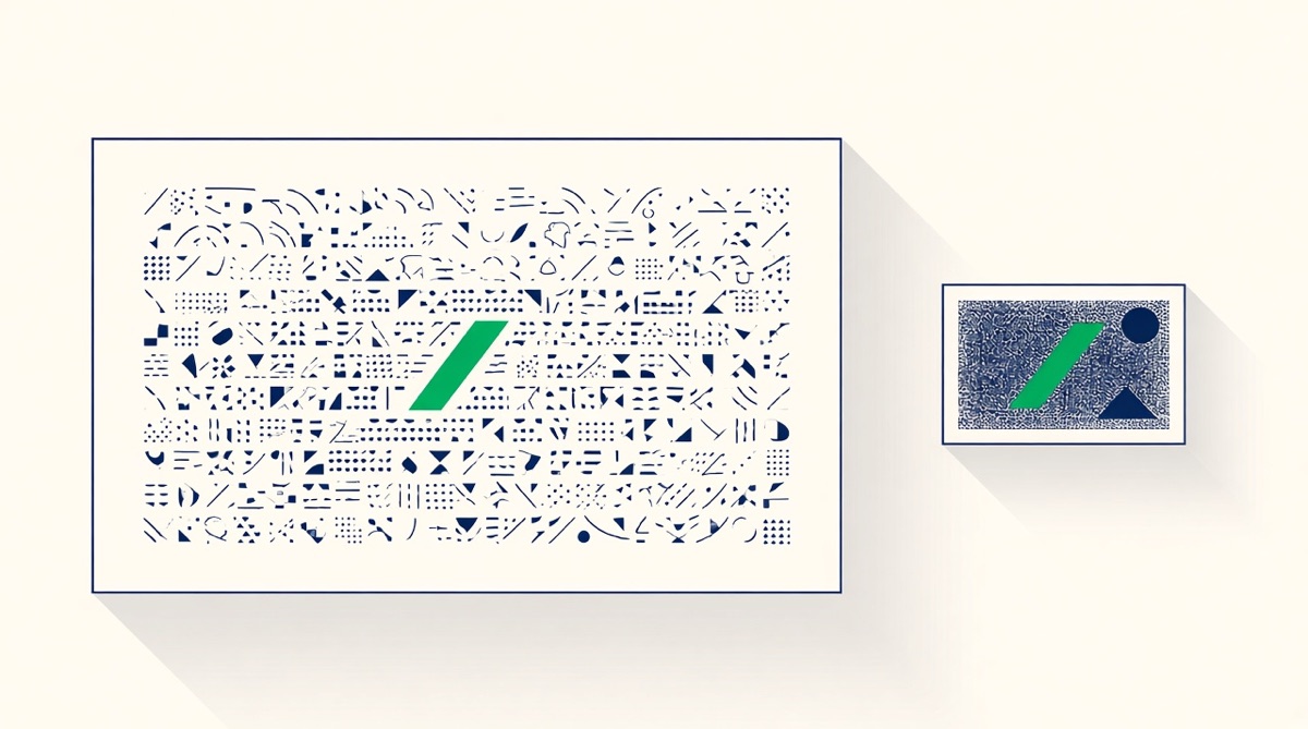
Almost every listing image is designed at 2,000 px on a 27-inch monitor and consumed at a few hundred pixels in one hand on a train. That single mismatch, not taste, is why so many infographics fail: the layout survives the shrink and the type does not. You do not need an opinion to fix this — you need a scale factor, a minimum type size derived from it, and a test you can run in five minutes without asking anyone's judgement.
How much mobile traffic, honestly
Enough that mobile is the design target, and the exact figure is genuinely contested. Traffic-analytics estimates for amazon.com in 2026 put mobile at roughly 57–58% of visits, and other trackers put it higher, in the 60–75% range depending on method and market. At the same time at least one consumer survey has most completed Amazon purchases happening on desktop. Both can be true: people browse on a phone and check out on a laptop. The design conclusion is the same either way. The first impression of your image set — the one that decides whether there is a second session at all — usually happens on a screen about the size of a passport.
The arithmetic nobody does
Take a 2,000 × 2,000 px image. On a phone, the detail-page carousel renders at roughly the device's logical width: about 390 points on a current iPhone, 360 to 412 on common Android handsets, minus page padding. Call it 360 points of usable width. That is a reduction of about 5.5×. A search-results thumbnail is smaller again, often a third to a half of the screen width.
| Where it is seen | Rough rendered width | Scale from a 2,000 px design |
|---|---|---|
| Detail-page carousel, phone | ~360 pt | about 1:5.5 |
| Search results, phone | ~150–190 pt | about 1:11 to 1:13 |
| Detail-page gallery, desktop | ~500 px | about 1:4 |
| Zoom view (needs 1,000 px+, 1,600 px+ recommended) | full screen | 1:1 or better |
Now run your own type through it. A 40 px headline on a 2,000 px canvas renders at about 7 points on the carousel. A 24 px caption renders at about 4. Neither is readable, and neither looks like a mistake in your design file — that is the trap. Every "why is this not converting" image audit should start with this multiplication rather than with the layout.
A minimum type size you can actually cite
Amazon does not publish a minimum font size for listing images. It does publish one for mobile ad creative, and that is the closest thing to an official statement of what Amazon considers legible on a phone. On its mobile shopping ad specs, Amazon requires 16 pt minimum text on 640×100 and 828×250 units, 26 pt on the 828×250 product and search placements, 32 pt on 600×500 units, and 48 pt for all text on the 2,560×2,560 Encore creative — with a blunt rule attached: the entire text must be legible on compatible mobile devices, and illegible ads are rejected.
The 2,560 px square is the useful one, because it is the placement closest in shape and scale to a listing image. Its 48 pt floor is about 1.9% of the canvas's longest side. Carry that ratio across and you get a defensible working minimum:
- Body and callout text: at least 2% of the image's longest side. On a 2,000 px square that is 40 px. Below it, you are under Amazon's own mobile floor.
- Headlines: 4–6% of the longest side, so 80–120 px on a 2,000 px square. This is the line that has to survive the search-results thumbnail.
- Nothing at all below 1.5%, which is 30 px at 2,000. If a disclaimer will not fit at that size, the disclaimer belongs in the bullets, not the image.
Two honest caveats. This is an advertising specification, not a listing-image rule, so it is a reasoned floor rather than a compliance requirement. And point sizes in that spec assume the ad's own render size, so treat the percentage, not the number, as the transferable part.
What else breaks at 1:5.5
Type is the loudest failure, but it is not the only one. Hairline rules and 1–2 px keylines disappear entirely. Thin display typefaces lose their thin strokes first, which is why a light weight that looks elegant at full size reads as broken at thumbnail size — go a weight heavier than feels right. Low-contrast palettes that pass on a calibrated monitor collapse outdoors on a phone at 40% brightness. Four-quadrant layouts, the default infographic reflex, put four competing messages into a space that can carry one. Callout lines pointing at a 30 px detail point at nothing the viewer can see. And any critical content near the frame edge is at risk, because mobile crops tighter than the desktop preview suggests.
The corollary is a hierarchy, not a rule: one message per image, stated in a headline that survives the thumbnail, with the supporting detail sized for the carousel and the fine detail reserved for zoom. Zoom is the only context where small text is legitimate, and it only exists above 1,000 px on the longest side, with 1,600 px or more recommended.
The five-minute test
Do this before every upload. It replaces argument with evidence.
- Export a 360 px copy of the finished image. That is the carousel size, roughly, and resampling it is the fastest honest simulation available.
- Put it on your actual phone — message it to yourself — and look at it at normal reading distance, at your normal screen brightness, not at 100% in a dark room. If you cannot read the headline in two seconds, nothing else about the image matters.
- Repeat at 160 px for the search-results case. Here you are not reading, you are recognising: can you tell what the product is, and does one word survive?
- Blur test. Apply a heavy blur to the full-size image. What remains legible is what a scrolling shopper actually absorbs. If nothing remains, your hierarchy is flat.
- Check it inside the real app. The most reliable version of this test is a live one: view a competitor's listing in the Amazon app, note which of their images you can read while scrolling, and hold yours to that standard.
Two further checks are worth building into the routine. Test in your longest language: German and French copy typically runs 15–30% longer than English, so a headline that fits at 90 px in English may need 70 px in German, which quietly pushes it under the floor. And test the images in the order they appear, since the first two or three are what a mobile shopper sees without deliberately opening the gallery — the ordering question is covered in how many images a listing should have, and the compliance baseline in the image requirements reference.
Design for the phone, keep the desktop for free
The reassuring part of designing to the mobile floor is that it costs nothing on desktop. Larger type, heavier weight, higher contrast and one message per image do not look crude on a 27-inch screen; they look confident. The reverse never works — a desktop-first image cannot be rescued on a phone by anything except a redesign. So set the minimums once, build them into your template, and stop relitigating type size per SKU.
Research your product, then generate the set
Paste one ASIN. Graflio reads the listing and its reviews, studies the best sellers around it, then renders a full set of on-brand infographics — every image still editable. €10 of credits free, no card.
Try Graflio free →