Amazon A+ Content: The Practical Guide for Sellers (2026)
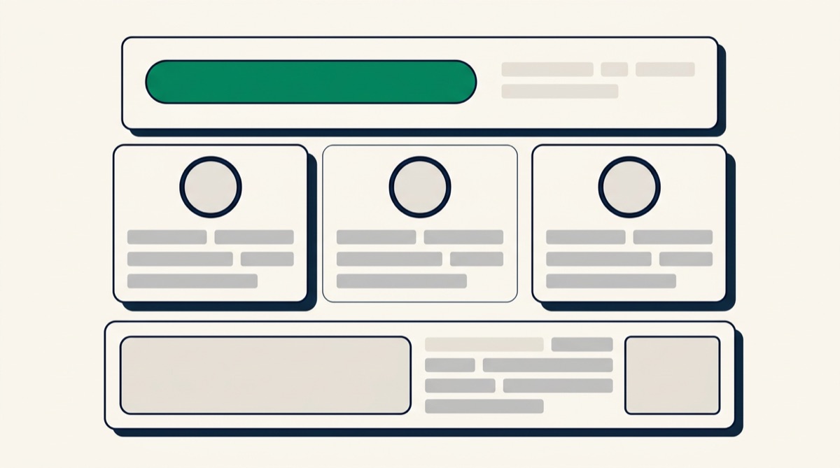
Amazon A+ Content is the branded section that replaces the plain-text product description with designed modules of images and formatted copy — the mini landing page you see below the fold on established listings. It is free at the basic tier for brand-registered sellers, and it is one of the few places on Amazon where you sell with layout and story instead of bullet points. Here is what A+ can and cannot do, and how to use it without repeating your image carousel.
What A+ Content actually is
Without A+, the description area of your listing is plain text. With A+, that area becomes a stack of modules — full-width banners, image-and-text blocks, comparison charts — that you assemble in Seller Central from a fixed library of layouts. Shoppers reach it after scrolling past the images, bullets and buy box, which shapes its job: A+ is not where the first impression happens, it is where the almost-convinced go to settle remaining doubts.
The gate: Brand Registry
A+ Content requires enrollment in Amazon Brand Registry, which in practice means owning a registered (or pending) trademark. Resellers of other people's brands cannot create it. If you sell your own brand and haven't registered, A+ is one of the strongest reasons to do it — alongside the storefront, brand analytics and protection tools that come with the program.
Basic vs Premium A+
There are two tiers, and the difference is bigger than the names suggest:
| Basic A+ | Premium A+ (A++) | |
|---|---|---|
| Cost | Free with Brand Registry | No fee, but eligibility criteria apply |
| Modules | Standard image + text layouts, comparison chart | Larger formats, video, interactive hotspots, carousels |
| Visual impact | Solid, catalog-like | Full-width, closer to a brand website |
| Best first move | Publish on every ASIN you can | Upgrade hero ASINs once eligible |
Amazon has changed Premium eligibility rules over time, so check the current criteria in Seller Central rather than relying on old blog posts. The practical order is simple: get basic A+ live everywhere first — an empty description area is the worst version of your listing.
The modules worth using
Comparison chart
The single highest-value module for multi-product brands. It places sibling products side by side with linked thumbnails, letting an undecided shopper switch to the variant that fits instead of leaving your catalog. It complements — not replaces — a comparison image in the carousel, which frames you against generic alternatives rather than against your own range.
Image header with text
The full-width banner most brands lead with. One strong lifestyle or hero visual, a short headline, two or three sentences of brand story. Its job is emotional: signal that a real brand stands behind the product.
Image and text grids
Three- or four-image modules with captions — ideal for use cases, care instructions, or "one product, four rooms" storytelling. They reward photography variety more than text volume; keep captions to one line where you can.
Complement your images — don't duplicate them
The most common A+ strategy mistake is re-uploading the same infographics that already sit in the image carousel. The shopper who scrolls to A+ has already seen your carousel; showing it twice wastes the space and reads as thin. Divide the labor deliberately:
- Carousel images win the first seconds: dimensions, key features, the comparison against alternatives — the fast objection-killers covered in our complete infographics guide.
- A+ Content earns the considered purchase: brand story, deeper use cases, materials and care, cross-sell to the rest of the range.
Keep the two layers visually consistent — same fonts, accent color and grading — so the listing feels like one brand from the first thumbnail to the last module. If you build your carousel in a tool like Graflio, reuse its palette and typography in your A+ modules. Together with strong images, A+ is one of the levers behind the conversion math explained in how images drive Amazon conversion.
Common A+ design mistakes
- Text baked into images at desktop scale. Modules shrink dramatically on phones, and most Amazon traffic is mobile. Oversize your in-image text or move it to the module's native text fields.
- Walls of copy. A+ is skimmed, not read. Headlines and captions carry the message; paragraphs are supporting cast.
- No comparison chart. Multi-product brands that skip it hand undecided shoppers back to search results.
- Off-brand visuals. Modules sourced from different freelancers at different times, with drifting colors and fonts, quietly erode trust.
- Banned content. The same rules as secondary images apply: no review or ranking claims, no Amazon branding, no unverifiable badges, nothing misleading.
Before you invest in Premium, make sure the basics across the whole listing are in order — our listing optimization checklist puts A+ in context with title, bullets and images.
FAQ
Does A+ Content cost anything?
Basic A+ is free once you are in Brand Registry. Premium A+ carries no fee either, but Amazon gates it behind eligibility criteria that have changed over time — check Seller Central for the current requirements.
Does A+ Content improve search ranking?
Not directly, as far as is commonly known. Its effect is on conversion: shoppers who reach the description area convert better when it answers their remaining doubts, and a stronger conversion rate feeds back into ranking over time.
Can I create A+ Content without Brand Registry?
No. A+ is exclusive to brand owners enrolled in Brand Registry. Until you qualify, invest the same design effort in your seven-plus image slots — they carry more of the buying decision anyway.
Research your product, then generate the set
Paste one ASIN. Graflio reads the listing and its reviews, studies the best sellers around it, then renders a full set of on-brand infographics — every image still editable. €10 of credits free, no card.
Try Graflio free →